WARNER BROS ID
RICH
HIGHLY DETAILED
IMMERSIVE
Create a 3D variant of the Warner Bro Logo from a list of films that are set to hit theaters 2025 and 2026.
concepts
design
animation
CONCEPTS 01+02
01
02
The Breach
“because I choose the hell of humans killing each other over the hell of being eaten” - Eren Jaegar
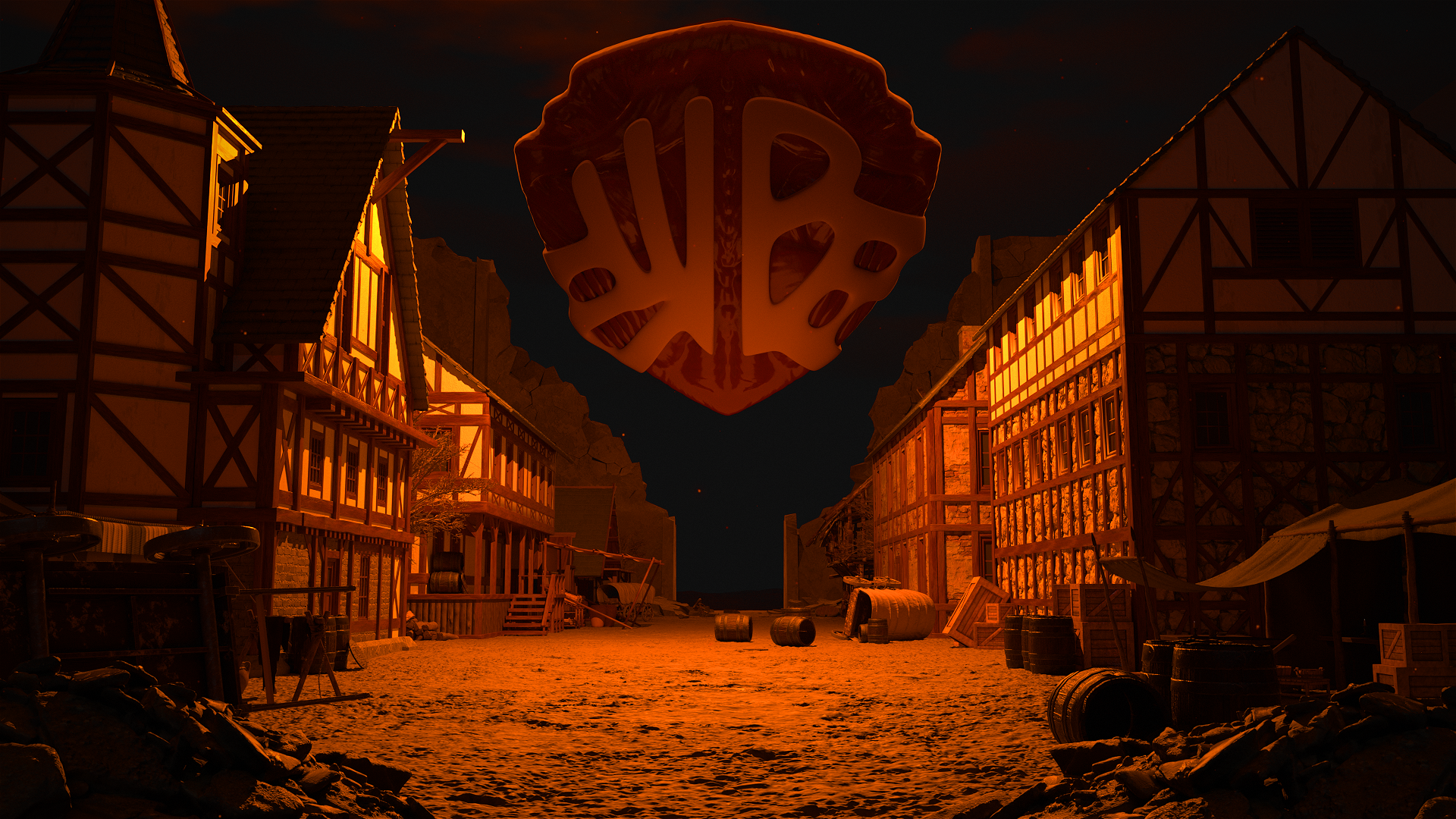
this logo concept utilizes the moment wall Maria fell. Many had died. However, it was this fated day that a survivor of the attack swore revenge against the titans. The design is inspired by the flesh and fascia that make up the anime’s Colossal Titan which, was the very titan the enabled the breach of Wall Maria.


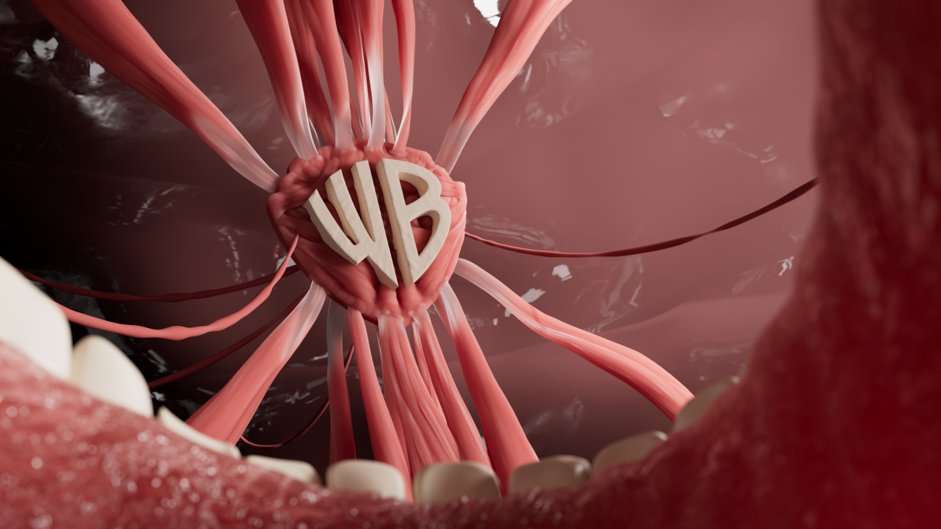
Within The Colossus
“If a human is in there, it explains the thickness of the spinal cord between the neck and brain… Their nape must be the location of the independent organ containing the substance that Titans are made of.” - Commander Erwin
Titans are humans connected to the titan from within the nape… for some very lengthy reasons. Nonetheless, this logo interpretation uses the fleshy logo but instead it is taken from within the titan body.
ZBRUSH
Logo DEV
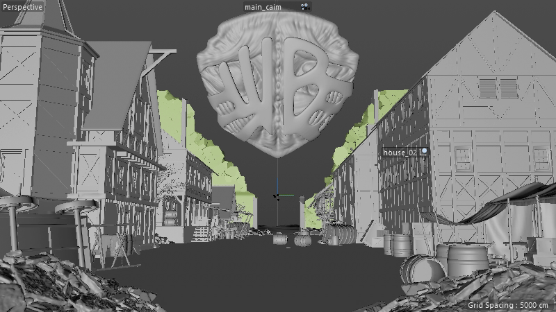
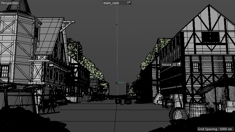
The creation of the Warner Bro Logo began in vector format with the use of Adobe Illustrator to ensure that everything part of the logo was to scale. I was able to use the spline information from Adobe Illustrator to create a high-poly base. In order to turn the Warner Bros Logo into tendons and other fascia, I had to sculpt the individual sections of the muscle and tendons.
Sculpting
All sculpting was done in ZBrush to ensure a detailed, organic model in a non-destructive workflow. I used brushes like clay buildup to create the overall mass and base striations of the muscles; then used the inflate brush to create the effect of higher and lower-most layers of intertwining muscles; and then with a dam standard brush I was able to finalize the striations of the mesh, as well as ensure the separation between different muscle groups.
VISUAL IDENTITY
Textures
This project utilizes many medieval materials (rocks, worn wood, plaster, concrete, etc.) to ensure the medieval setting of Attack on Titan was captured accurately. As for the logo, it was mixture of raw meat materials and Redshift adjustments like coating and subsurface scattering to represent the organic and translucent quality of flesh. All surface structures of the model were made by hand in Maxon’s ZBrush as a proficient solution to the project’s need for a high-poly mesh using the program’s clay buildup, dam standard, and inflate brushes. The buildings were a mixture of low and high-poly modeling based on visibility and importance of the material displacement.
Color Palette
Fleshy. Crimson. Scarlet.
The color palette of this film is put in place to paint the scene in a fleshy, organic environment of muscles, tendons, cells, and other parts of the body that make this project feel like we are in a way surgically under the skin; the lighting playing a role in that, as well.
The scene recreates the titan-shifters’ breach of Wall Maria in order to interfere with the lives of humanity in search of an individual within the walls that could help or end humanity.
CINEMA 4D
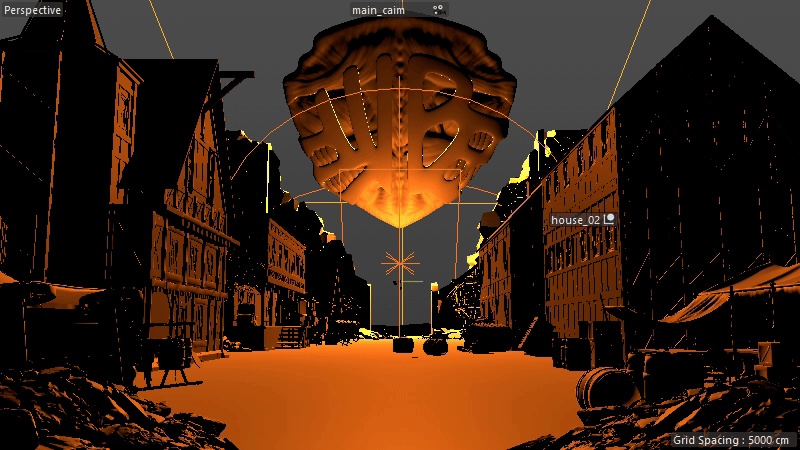
Lighting
I used Cinema 4D and Redshift to build a lighting setup that casts a menacing tone across both the houses and the Warner Bros. logo, emphasizing the moment the logo breaches the wall. The shot is framed using an inverted-Y composition, creating strong symmetry that continuously guides the viewer’s eye toward the central subject.
Texturing
For the textures, I used a range of Redshift features to get as close to realism as possible so the environment would feel eerily immersive. A major focus was determining which areas needed additional geometry to maintain realistic detail as the camera moved closer or farther away. For the logo, I let the hand-sculpted forms do most of the work, then applied raw-meat textures to create an organic feel across the muscle and surrounding fascia.
Signficance
The intense, scorched lighting echoes the atmosphere of the original Attack on Titan poster, which depicted a burned, devastated landscape. This treatment makes the environment feel vulnerable and abandoned, allowing the logo to stand out as an intrusive, foreign presence that reinforces the overall tone of the piece.
Redshift
Much of this piece relied on getting Redshift to properly displace materials, which required precise node setups and a careful use of the Redshift Render Tag workflow. Although the muscles were heavily detailed in the sculpt, they still depended on subsurface scattering and surface coatings to achieve the final, life-like qualities real muscle tissue has. The final look came down to meticulous UV mapping and fine-tuning of material settings.
Animation
The animation of this piece is mostly a camera move minus the possibility of smoke and fire effects in the future. Despite this, I did want to include more camera work that would contribute to the menacing feel of the logo. What was the solution to that.? I allowed the camera to dolly in and then I was able to create a vertigo effect by tuning the cameras focal length at the camera focused on the logo. This gave a better effect of moving through the environment, as well as made the world feel large as the focal length distorts them.
Animation SFX
The sound effects were specific combination of sounds originally stylized with the help of Kelly Warner, the on-site sound designer for our motion design department. I would later adjust what effects stayed in and added a music track over top the scene that would fit the tone of world created by the combination of elements that came before SFX.
